Zeds dev diary 20240804
I’m learning some new SwiftUI APIs by writing a “do it later” iPhone app called Zeds (ok fine… it’s a to do app, and yeah, that name is meant to sound like snoring but doesn’t work for US readers).
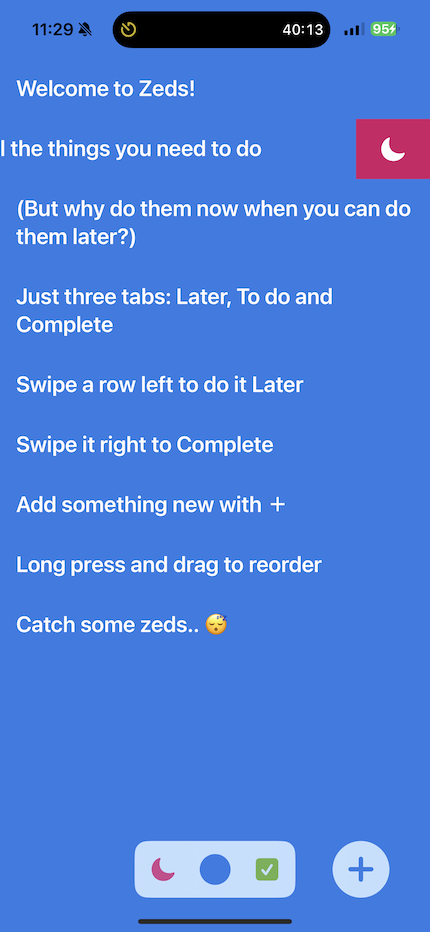
The premise is to boil everything down into just three lists: things to do later, things to do now, and things I’ve done. These lists are laid out next to each other in space from left to right.

Only one list is visible on the iPhone screen at a time and tasks are moved between them by swiping left or right. A stylised tab bar at the bottom lets you switch between the lists. Essentially it’s Kanban with nice gestures. I asked some beta testers to try this out with no help except for some initial built-in tasks acting as a user manual.
Although it all seemed clear and simple to me, no design ever survives first contact with the user. :)
My testers initially found the app confusing:
- on launch there appeared to be only one list
- it wasn’t clear what each tab icon represented, or even what the tab bar did
- the instructional tasks looked like a large block of help text rather than sample items in a list
This confusion stemmed from some of my design choices:
- no labels on the tab icons and no title on each list
- the principle was to minimise the amount of text in the UI to focus on the user’s text in the lists
- replace the standard iOS tab bar with a minimal tab switch
- show the to do list without indicating there are other lists either side of it
- the tab bar is meant to convey this but doesn’t
- remove separators and other visual indicators of the list rows
- the list looks “cleaner” but is less obvious for new users
Next steps to consider:
- labels on lists
- fewer, simpler instructional tasks
- an initial animation to indicate the lists positions in space
- a more “direct” way of switching lists than the stylised tab bar
- separators or otherwise distinguished list rows
